ImagePixel guide
How to Turn an Image into Pixel Art: Grid Width, Colors and Dithering
Turning a photo or drawing into pixel art is two decisions made in order: how many cells the picture is divided into, and how many colors those cells may use. Most disappointing results come from getting one of the two wrong, not from the tool. This guide walks through both decisions with real outputs, explains what dithering actually does, and ends with a checklist for fixing common problems.
You can follow along in the ImagePixel converter. It runs in your browser, so the image you test with is not uploaded.
Updated October 9, 2026. Every example image on this page was produced by the current ImagePixel converter code with the settings shown in its caption.
What the conversion actually does
A pixel-art converter is not a filter that draws pixel art from scratch. It resamples your picture onto a small grid, so each cell takes the average color of the area it covers, and then optionally replaces every cell's color with the nearest color from a limited set. That is the whole pipeline, and each setting you see controls one of those two steps.
In ImagePixel the steps are: (1) the image is scaled down to the chosen number of columns, with rows calculated from the original aspect ratio; (2) if you chose a fixed palette or a Max Colors limit, every cell is matched to the closest color in that set, measured as straight-line distance between RGB values; (3) optionally, dithering spreads the rounding error to neighboring cells. The result is then shown enlarged with hard edges so you can see every cell.
Knowing this explains a lot of surprising results. Small details disappear in step 1 because they are averaged away, and colors shift in step 2 because the nearest color in a small set may be quite far from the original. Neither problem is fixed by turning more knobs at random; you fix it by changing the grid width or the color set deliberately.
Step 1: choose a grid width
Grid width is the number of cells across the image. It matters more than any other setting because it decides how much of the original shape survives. Here is the same 960 × 720 treasure-chest illustration at the four preset widths, using the image's own colors so that only the grid changes.
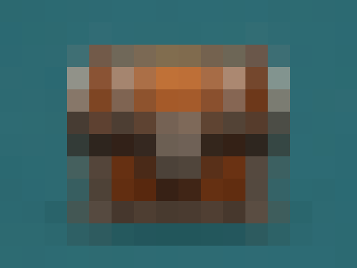
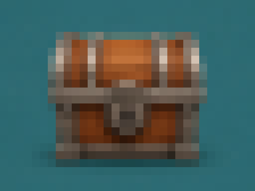
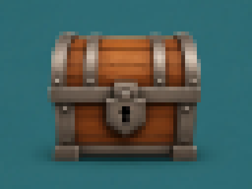
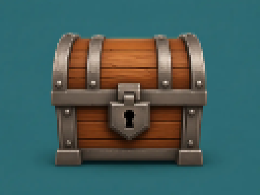
A useful rule: pick the smallest width at which the subject is still recognizable, then go one step up if a key detail (eyes, a logo shape, a keyhole) is missing. Every doubling of the width multiplies the cell count by four, which matters if you plan to build the result by hand in beads, stitches or blocks.
The rows always follow the image ratio. A 4:3 image at 32 columns becomes 32 × 24; a square image becomes 32 × 32; a tall phone screenshot at 32 columns can become 32 × 69. If you need an exact canvas such as 32 × 32, crop the source to that ratio before converting.
Columns or pixel size?
The converter offers two ways to set the grid. By columns fixes the number of cells across (16, 32, 64 or 128) and is the right choice when the cell count matters, for sprites, bead boards or block builds. By pixel size sets how many source pixels each block covers and keeps the output at the original image size, which is the better choice when you just want a pixelated version of a photo at its existing dimensions. The pixelate image tool starts in pixel-size mode for that reason.
Step 2: limit the colors
A grid alone gives you a blocky image, but pixel art usually also has a deliberately small color count. With the Max Colors setting, ImagePixel builds a palette from the image itself: it repeatedly splits the image's colors into two groups along the channel (red, green or blue) with the widest spread, until it has the number of groups you asked for, then uses each group's average color. This is the median-cut method, and it spends more colors on the tones that cover more of the picture.
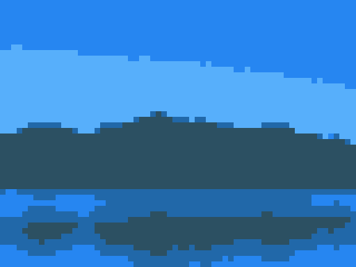
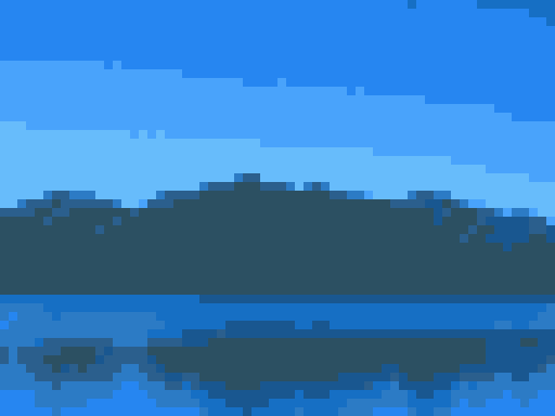
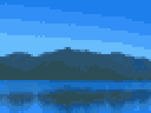
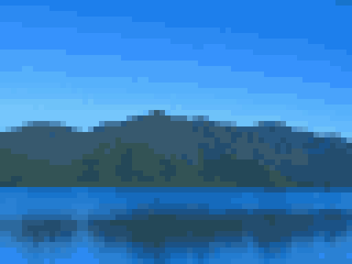
Notice what the counts reveal. At 4 colors on this 64 × 48 grid, the color counts are 936, 932, 711 and 493 cells, and every one of those colors is a shade of blue or blue-grey, because sky and water cover about two thirds of the picture. The mountains are a minority, so median cut gives them a single color at 4 and only starts to separate their slopes at 16. If a small but important part of your image loses its color, either raise the limit, crop away some of the dominant area, or switch to a fixed palette that contains the color you need.
The homepage converter opens at 32 columns and 16 colors because that combination keeps most subjects recognizable while still looking like pixel art. Treat it as a starting point, not a recommendation for every image.
Fixed palettes vs. Max Colors
A fixed palette, such as Game Boy, PICO-8 or Minecraft Wool, does not look at your image at all. Every cell is simply moved to whichever palette color is nearest. That gives a consistent, recognizable style, but the result depends heavily on whether the palette has colors near your image's tones. A four-shade green palette can make a brown chest readable; a black-and-white palette with no mid-tones can turn the same chest almost entirely black.
Use Max Colors when you want the picture to keep its own character with fewer colors. Use a fixed palette when you need to match an existing style, a console look, or a real set of materials. When you pick a fixed palette, Max Colors is switched off because the palette already defines the color count. The palette reference shows the same image through every built-in palette with each palette's exact hex values.
When dithering helps, and when it hurts
Dithering is available once a palette or a color limit is active. ImagePixel uses Floyd–Steinberg error diffusion: when a cell is rounded to the nearest palette color, the difference is passed on to the cells to the right and below (7/16 to the right, 3/16, 5/16 and 1/16 to the row beneath). The result is a pattern of mixed cells that, seen from a distance, approximates in-between colors the palette does not contain.
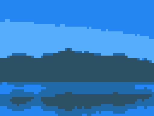
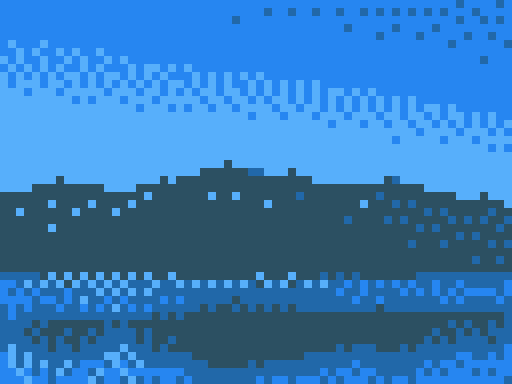
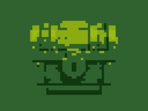
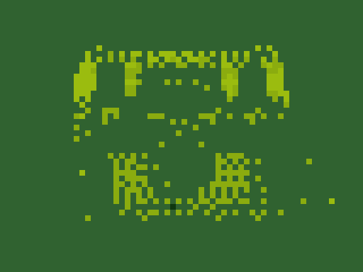
The rule of thumb from these two pairs: dithering helps on smooth gradients such as skies, skin and studio backgrounds, and hurts on images that are already made of flat shapes, such as icons, logos and illustrations. It also hurts anything you plan to build by hand, because isolated single cells of a different color are tedious to place and look like mistakes at close range. For bead patterns, cross-stitch charts and block builds, leave dithering off.
Exporting: clean PNG, grid PNG and symbols
The download is always a PNG. A clean PNG defaults to the browser-decoded source size in both column and pixel-size modes, so a 1001 × 667 source downloads as 1001 × 667. Choose One pixel per cell when you want the logical grid itself, such as 32 × 21 for a 32-column 1001 × 667 image; enlarge that small file with nearest-neighbor scaling, not smooth scaling, or the edges will blur.
The grid PNG option is separate from the clean PNG size. It enlarges each cell and draws thin lines between them so you can count cells, and the converter shows the resulting chart dimensions before download. Cells are drawn between 2 and 24 pixels wide, capped so the long side does not exceed 2,048 pixels: a 32 × 24 grid exports at 768 × 576, and a 128 × 96 grid at 2,048 × 1,536. When a palette or color limit is active you can also add symbols, one shape or letter per color, which makes the chart usable when printed in black and white. The pattern guide covers that workflow.
Choosing a source image
- One clear subject. At 32 columns there is room for one object or one face, not a group photo.
- Strong contrast between subject and background. If both are mid-grey, they merge after averaging.
- A plain background, or none. Fully transparent areas of a PNG stay transparent and are not counted as a color.
- Crop first. Every column spent on empty space is a column taken away from the subject.
- Avoid fine text. Letters smaller than about one twentieth of the image width will not survive below 64 columns.
Troubleshooting checklist
- The subject is unrecognizable.
- Increase the grid width one step, or crop tighter so the subject fills more of the frame.
- An important color disappeared.
- Raise Max Colors, crop away the area that dominates the picture, or choose a fixed palette that contains a similar color.
- The result is mostly one dark color.
- The fixed palette has no colors near your image's mid-tones. Try a palette with more shades, or use Max Colors instead.
- The image looks noisy or speckled.
- Turn dithering off. It is meant for gradients, not flat artwork.
- The downloaded file is tiny.
- Check the PNG size setting beside the download button. Original image keeps the source dimensions; One pixel per cell is intentionally small at the logical grid size. Use the grid PNG for a large chart, or scale the small clean file with nearest-neighbor in your editor.
- What the converter does not do.
- It does not generate new artwork with AI, remove backgrounds, edit individual cells, accept custom palettes, or export JPG, WebP or game files. It converts the image you give it, locally, to a PNG.